Development

Mysterious Mechanics

You may not know or care how your car works, but when it dies on the highway, you'll probably wish you did. The MECHANICS of your website's code, as well as what's known as the User Experience (UX) and the User Interface (UI), is like that, too. Whether you understand it or not, it can stop your business cold.

That's because those heiroglyphics under the hood have everything to do with where your organization lands on search engine results, how many customers make purchases on your website, and how vulnerable you are to lawsuits for accessibility violations. The truth is, you can't afford to ignore that MYSTERIOUS engine-thing.

Luckily, Sarah Susan is a sharp-shooting front-end coder with the usability skills and knowledge to make sure YOUR WEBSITE is 100% road-worthy. Email me at sarah@sarahsusandesigns.com or call 734-707-7478 to get the custom-coded makeover your organization deserves!

Competitive Analysis:
A2 Bank

Student Work

I wrote this report for the requirements-analysis phase of a site design for a fictitious bank. In the report, I compare the sites of four banks—two local and two national—to better understand industry standards.

View PDF of Competitive Analysis Report

Usability Testing Report:
Ann Arbor Art Center

Student Work

Working with a partner who shared in the research, I compiled this report analyzing the data from our testing. The testing revealed many opportunities for improvement for the Ann Arbor Art Center website, most notably in their shopping cart application.

View PDF of Usability Testing Report

Expert Review:
Humane Society of Huron Valley

Student Work

This Expert Review analyzes the Humane Society of Huron Valley website according to commonly-accepted usability guidelines. My partner and I compiled many recommendations to address the site's complex architecture and interface.

View PDF of Expert Review

Site Deconstruction:
Matthaei Botanical Gardens and Nichols Arboretum

Student Work

The Site Deconstruction report provides both a site outline and a site diagram describing the majority of the Matthaei Botanical Gardens and Nichols Arboretum website. My deep exploration of this site served as a stern warning to make clear, logical architecture my top priority in design.

View PDF of Site Deconstruction Report

Accessibility Inspection:
Literati Bookstore

Student Work

In this report, my partner and I analyzed the usability of the Literati Bookstore website from the standpoint of accessibility. We created a comprehensive set of recommendations to ensure this site is accessible to people of all abilities.

View PDF of Accessibility Inspection

Card Sorting Report:
Shedd Aquarium

Student Work

For this report, I had subjects group cards with labels currently in use on the Shedd Aquarium website, according to their own organizational preferences. The data revealed which labels on the site could be confusing to users.

View PDF of Card Sorting Report

Interface Redesign:
Ann Arbor Ice Cube

Student Work

This report analyzes the interface of the Ann Arbor Ice Cube website, based on interface design principles. Recommendations for improvements and wireframes of a revised interface are included.

View PDF of Interface Redesign Report

Task Analysis and Storyboards:
American Red Cross

Student Work

This report includes comprehensive task analyses for processes offered on the American Red Cross website, revised versions of those processes, and wireframe storyboards delineating the recommended changes. In my revisions, I relied heavily on AJAX calls to avoid page reloads and achieve a smoother flow. A style guide codifying these and other recommendations accompanies this report.

View PDF of Task Analysis and Storyboard Report

Engineering

cindi.eng.wayne.edu

View of VRWP application interface.
VRWP Virtually Guided RSW Weldability Prediction

Never in my wildest dreams did I realize how complicated welding can be. But designing and coding an interface for a team at Wayne State University definitely opened my eyes. Created by the CInDI (Computational Intelligence and Design Informatics) Laboratory, this software allows engineers to input, store, and test data about welding, all while sipping coffee in the comfort of their air-conditioned offices.

All the sweating was left to the developers, and me, of course—because I had to literally look up every engineering and statistics term the team used. And once I had a vague idea of what was happening in the app, I needed to find a way to display reams of data on mobile devices. My solution was to create small scrollable windows for each table. I hid everything in collapsible sections, and included a side navigation menu, complete with icons, to help users quickly move through the system.

Simple as it all sounds in retrospect, my task was complicated by the fact that the developers had already created an interface based on the framework of their Java coding, as opposed to the needs of an actual user, particularly one on a phone. Having studied Java in college, I could see their error right away, and I had to gradually convince the developers to refrain from asserting their Java structures in the interface. I was about 75% successful in this endeavor—something I'm very proud of.

In the end, I managed to categorize and present components I barely understood well enough to create a usable experience for the coffee sippers. Most importantly, I'm told the investors really liked it.

View the VRWP Application Interface.
NOTE: This version has been edited to protect the intellectual property of its creators.

Engineering

cindi.eng.wayne.edu

View of CInDI website.
Cindi: Computational Intelligence and Design Informatics Laboratory

Creating an application interface for the elite tinkerers at CInDI was mind-expanding, to say the least. I was pretty relieved when instead of parsing sophisticated statistical metrics, the team asked me to make a simple website for their laboratory. "Easy peasy," said I.

The original site was plagued with very long pages that required scrolling down for content, and then back up for navigation. For faster navigation, I created a horizontal submenu off the global menu to let users quickly see their options and choose where they want to go. I then coded the content and image sections to be collapsible, allowing the user to shorten the page and open only those sections they want to look at.

View the CInDI Computational Intelligence and Design Informatics Laboratory Website.

Law

dsteinlaw.com

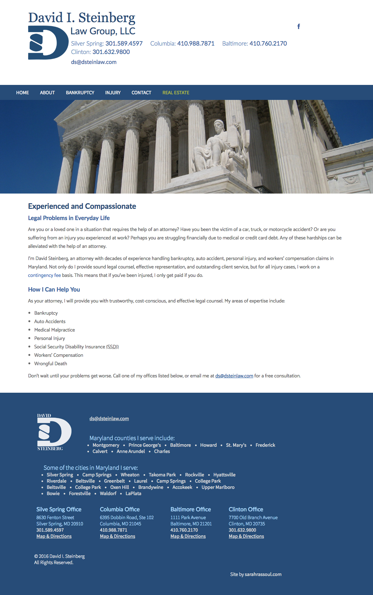
View of law website.
David I. Steinberg, LLC

This website was originally created by another developer in Wordpress. The code was untended, bloated, and disorganized. I purged the code, streamlined the layout, edited out a good 80% of the text, and added coding for accessibility. Removing the unnecessary javascript and php files, my clean little HTML site loads up in the blink of an eye.

I further ramped up this client's SEO by painstakingly microdata-tagging anything that moved. At one point, you could google, "Lawyer Silver Spring Maryland," and this site was at the top. Here's the proof.

In fact, I may have taken the microdata tagging a little too far. Here's a trifecta of David—Maryland's favorite lawyer.

View the Attorney's Website.

DsteinRealty

Real Estate Agent

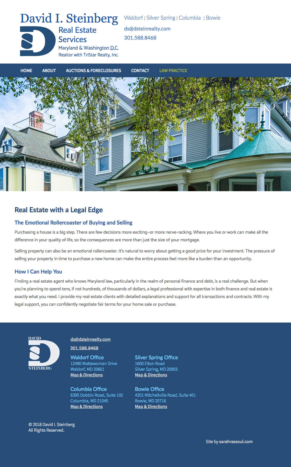
View of VRWP real estate website.
David I. Steinberg Real Estate Services

My attorney client wanted to augment his thriving bankruptcy business by becoming a realtor who specializes in auctions, foreclosures, and short sales. I recommended we create a separate real estate site and link it with his law site. This would keep navigation easy for the user, and also strengthen his overall branding and SEO.

I take credit for the flowing prose in this site, edited by my client, of course. And I taught myself enough PHP to add a simple contact form.

View the Real Estate Website